We often say proudly on this blog that we only work three or four hours per day. Well that just hasn’t been the case for the past few months! All of this extra time spent on the computer was used to create this new design that you’re looking at right now.
We invested a considerable amount of money and even more time to try to fix things that you pointed out in our last survey, and make the site easier to navigate and more fun to read.
We’ve had nearly a dozen Skype calls with our design and development team in the UK, we’ve spent hundreds of hours sending emails back and forth, creating documents to explain what we want, and replacing more than 1,300 images on the site!
On Friday, the final day before the launch, we actually put in an eighteen and a half hour day finalizing all of the pages! Compared to our normal three hour days, this was insane. By 2:00am, we were exhausted, but as you can see from the photo below… we had some wine to help us along.

I know some of you are probably thinking that you liked our design before and it didn’t need a change. But with the internet changing every day and with new developments appearing in site design and SEO, it’s important that we keep our blog up to date.
The last time we did a redesign (just over a year ago), we were very pleased with the look of it, but many parts of the site were hard to navigate and some of you mentioned that you couldn’t find what you were looking for. We hope to have fixed this, and hundreds of other issues with the new and improved Goats On The Road blog.
Please Note: This is a brand new design using all new formats and styling, many of which haven’t been used online before. There are bound to be some glitches, so it would help us a lot if you could contact us and tell us about any errors that you see.
So, What Exactly is Different?
Everything.
The new design isn’t just different from our old one, it’s different from every blog on the internet today. The reason this project took so much time is because we weren’t just changing the look of our blog, we were trying to – as our web designer Scott puts it – “Blow the web apart”.
Coming up with completely unique functionality that helps the user experience is a massive job. Trying to do things that have never been done before isn’t easy and I wouldn’t trust anyone but Eldo Web Design to do this for our site.
So let’s get into exactly what we did…
An Image Based Design
We love photos, but we felt like our images weren’t being featured properly on our last design. All of the images were too small and it made it really hard for readers to get a feel for our photography style. Plus the pages were so cluttered with a side bar and floating elements that the eyes were always distracted from the site’s photography.
The new design is heavily image-based, with massive, screen-wide images at the top of every post and beautifully designed carousels that not only showcase our photos, but also allow users to scroll side-to-side to reveal more content and hover to show handy descriptions of each post or section.
We wanted the new design to show our photography in a new and unique way and I think it does the job beautifully.
Our New Logo
We couldn’t stand our last logo, mainly because there was no goat! Our original logo way back when we started this blog in 2012 had a couple of cute little sheep, until we found out that we were sheep on the road and had to change them.
![]()
So we made some minor adjustments back in 2014 and came up with this one:
![]()
Still a little bit amateur but we were finally goats and we had a nice little tagline going on. We made an other update to the logo shortly after this and it looked like:
![]()
But the goats were barely visible. I have no idea why, but our next variation in 2015 was completely goatless!
![]()
Now we finally have a logo that is sleek, has a goat, and is fun all at the same time. It suits our current site and looks good on t-shirts, business cards and hats. Check it out!
![]()
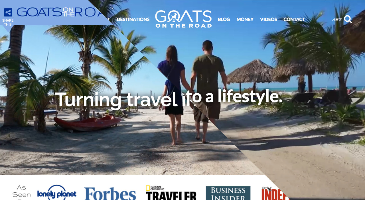
The Home Page
When you first come to our home page, you may not immediately notice a big difference. We still have the big video looping in the header and our regular menu items, but we now have a button that says “About Us” with a video play button. This button launches a pop-up with a new video created all about us Goats and our blog! As you scroll down on the home page you’ll see that there are big changes.
You’ll notice now that the site has a lot of white space. Everything is very simple and easy to read. We know that some people like coming to a site with lots of colours everywhere, and that is great at first.
But at the end of the day, everyone visits blogs to read articles and look at photos. By minimizing all the distractions, we believe that the new blog highlights these things and enhances the user experience.
The Start Here Page
This is an important page on any blog because it has all of the best content, and explains more about what the site is all about. Our new Start Here page has pretty much everything our blog has to offer, all in one place.

Again the design is simple, clean and easy to read.
Reading Posts
This is one of the biggest changes we made to the site. We’ve always prided ourselves on the fact that our site doesn’t have any distracting advertisements.
We absolutely love it when we get emails from readers that say: “I love that your site doesn’t have flashy banner ads anywhere”, or “how do you even make money? Your site doesn’t seem commercial or advertisey at all!”.
We’ve taken this to the next level with our new site design. When you’re reading posts, looking at pages or just browsing our site for the right content, you’ll never have a sidebar (that column of pictures and text on the side of the screen) unless you choose to expose it.
Just look at how distracting these can be:
While our old site never had any ads on the side bar and already was less distracting than most, it still had some pictures and links leading to other posts on our site. We believe that our readers are coming to our blog to read, so we wanted each and every post to have the cleanest reading experience possible.
Now you will only see the sidebar if you click the “Sidebar” button to reveal it, and when you’re done looking at it, you can simply click the “x” to hide it again. We’ve also removed any floating share buttons and annoying pop-ups that cover the screen to try to enhance the reading experience.

Yes we could make some money from posting up ads in our side bar, and yes we could get more newsletter subscribers by having an annoying pop-up, but our idea is that if you want to see those things, you can easily choose to do so, otherwise you’re free to read our blog without any distractions.
The “Blog” Page
We appreciate that when people click on “Blog” in the menu bar, they want to see all of the posts that are on the blog. Along with our most recent posts, we also included a description of what our blog is about so that new readers can get a feel for the site right off the bat.
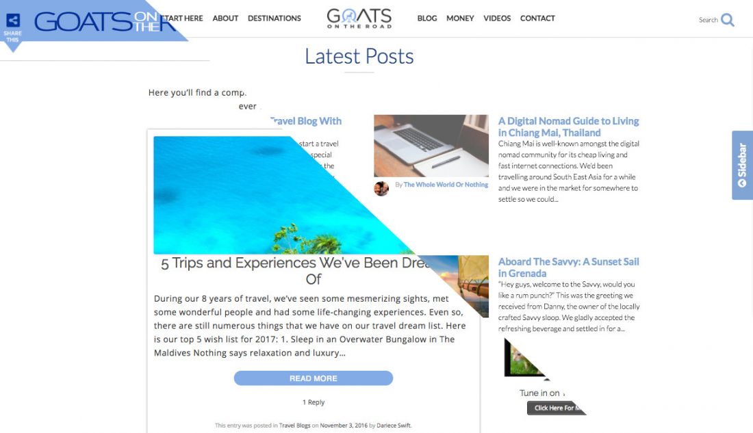
And we don’t only show the new posts from our blog on this page, we also guide readers to much of our most important content, including our travel guide series, our personal story and other topics that may be of interest.
Category Pages
These are pages that list a series of posts like each individual continent & country pages, or topic pages like Travel Blogging & Couples Travel. These are still the basic list of posts that you expect to find when you click on these types of links, but from here you can also find other topics on our blog and a simple opt-in for our newsletter and free eBook.
Note: The new site offers a free travel eBook which will be available soon. If you’re already subscribed, don’t worry, you’ll get one in your inbox this week.
Make Money For Travel Page
This is a very important page on our website because it is one of our most visited pages, but it’s also the theme of the entire website: “how to make money on the road, so that you can travel for as long as you want”.
On our previous site, the styling was a bit awkward and made it hard to find what you’re looking for. We simply had 4 boxes that listed text links leading to individual posts, but users weren’t able to see any inspiring images for each post before clicking them, and the scrolling boxes didn’t work on mobile devices.
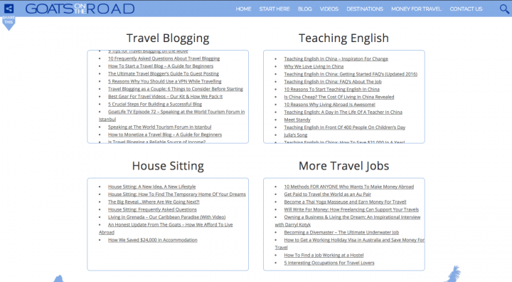
The new Make Money For Travel Page has the same beautiful carousels that slide the content left to right. Now you can see 16 posts from each category (Travel Blogging, House Sitting, Teaching English, Digital Nomad Lifestyle & More Travel Jobs) by sliding the carousel left to right. When you hover over each image you’ll see a description of the post to get an idea of what it’s about.
If you don’t find what you’re looking for in those 16 articles, you can click the button below the carousel that says “See All Posts” and it will bring you to a list that includes every post on that topic.
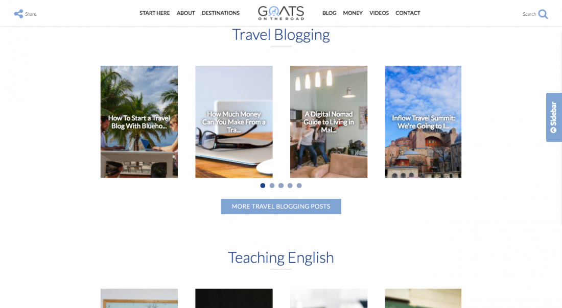
This is an entirely unique way of displaying content on the blog and we think it seamlessly marries functionality, image-focus and user simplicity. These easily slide side-to-side on mobile with the swipe of a finger.
The Destinations Page
This page is very similar to the Destinations Page on our previous design. It starts with a handy, clickable map so that you can choose which country you want to read about, and then it goes into a list of countries separated into regions.

Again we’ve used the carousel display below this to make it easier to see more content, with brief descriptions and inspiring imagery.
The Video Page
If you’ve been following us for a long time, you’ll know that we spend a lot of time and effort on our YouTube Channel. Unfortunately, on the previous site, the videos weren’t showcased very well. The only way to see the videos was to click each individual post, open it and then hit play on the video.

The videos weren’t organized in any way and if you didn’t know that there were videos hidden in the posts, you’d probably never see them.
Now we’ve organized all of our videos into different countries so that when you click on “Videos” in the navigation menu, you’ll be brought to a new custom page.
This page has a map at the top so you can choose the country you want to see videos about, or you can scroll down and choose a country from the list below. When you click one of the countries you’ll be brought to a new page with all of our videos shot in that country.
Click any of the videos and voila! They’ll play right there on the screen in a nice big pop-up window. If you just want to see a bunch of videos directly from the main Videos Page, just click the button that says “See All Videos” and you’ll be brought to our YouTube Channel where you can subscribe, and check out all our videos in one place.
The Footer
This is the area at the very bottom of every single post, page and category on our website. We also wanted it to be simple and uncrowded, but still show all of the information that a reader is likely to expect from this area on a website.

The big thing down here is the “I Want To…” section. This is a part of our site which was designed 100% with you, the reader, in mind. What do you want to do? Why did you come to this site? We give you 5 main options to help you find what you’re looking for.
We put this at the bottom of every page in case you reach the end of a post, page or category and you don’t know where to go next. Hopefully this section will help you to navigate to the most valuable parts of our website so that you can find more travelly goodness!
Below that we have an Instagram feed so you can see our latest live photos.
Overall…
Despite the fact that we are exhausted from staring at the same website and making minor changes to it constantly over the past few months, we are very happy with the result so far. But this is not the finished product.
We really need your help to make sure that the site looks, runs and functions in the best way possible. We would really appreciate your feedback and if you run into any errors, issues or difficulties with the site, we would love it if you could contact us and tell us about it.
We created this new blog to better serve all of the people who read it and draw inspiration from it, so there’s no point in finalizing the design until we have your approval and suggestions!
Thank-you all so much for reading our blog and continuing to support us on this journey.
Sincerely,
Nick & Dariece
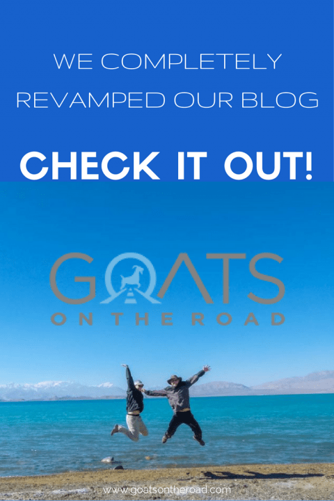
Like this Post? Pin it!